
Problem:
VIZIYA’s scheduling product lacks a fluid scheduling work-flow and the prioritization of work that helps make more effective schedules. The result of this has caused an inefficient use of resources, time and capital.
My Roles:
User Research, Ideation, Product Strategy, UI Design, Rapid Prototyping, User-Testing
Solution:
Redesign VIZIYA’s current scheduler, focusing on work order prioritization. Give the design a fresh look & feel while establishing VIZIYA’s branding and maintain core functionalities.
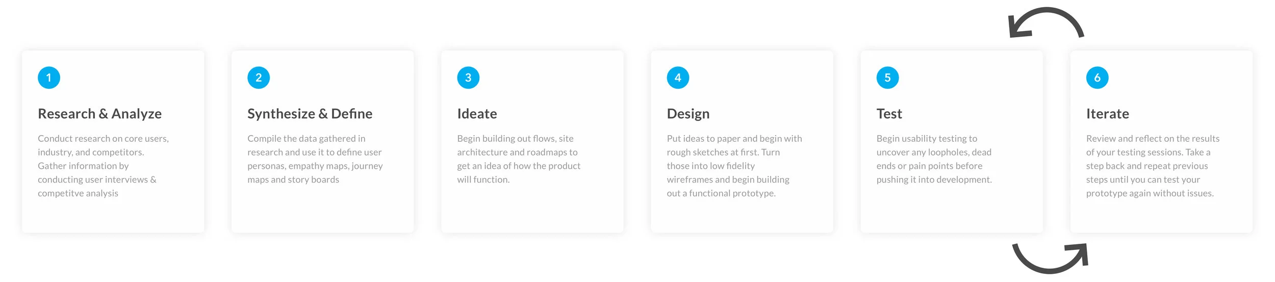
Design Process
Discoveries & Pain Points
The analysis of the current scheduling experience was central in the redesign project I have undertaken. It was important to capture the entire user-flow of the current scheduling experience. The in-depth analysis of the current interface helped me define what I had to work on. This was done through the use of a journey map.
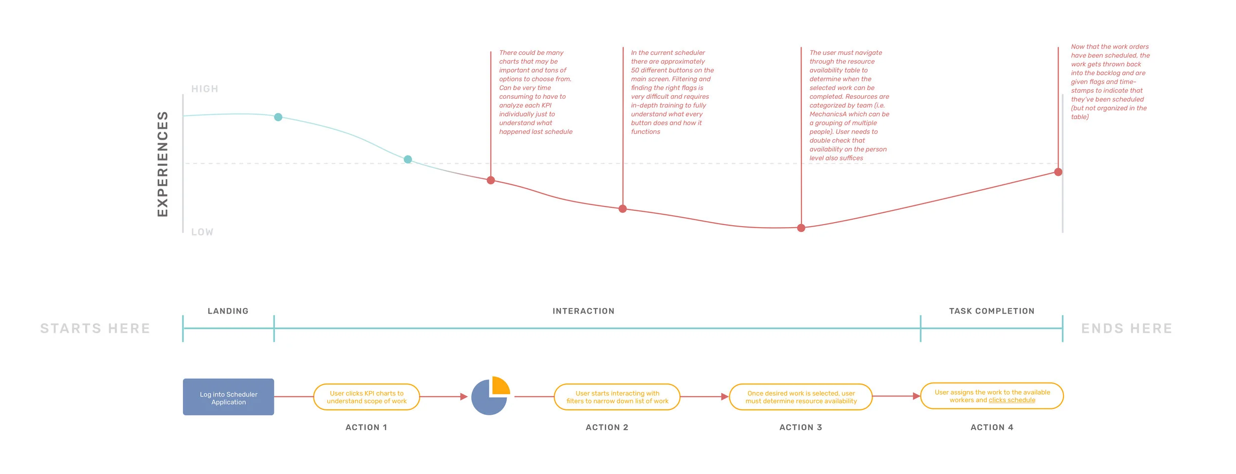
After 2 days of investigation, I gained a good understanding of the strengths and weaknesses of the product. Here are some of my discoveries after speaking with the end users:
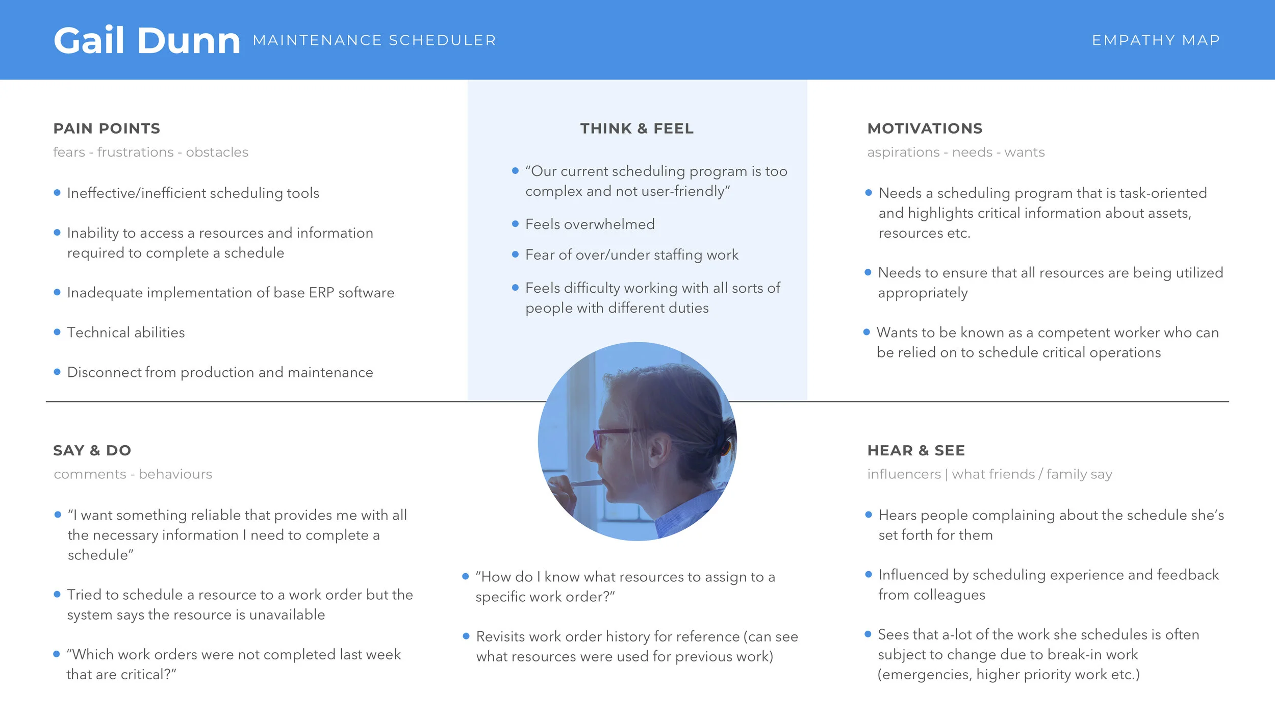
Users complained that their current scheduling program is too complex and not-user friendly.
Users said that they need a scheduling application that is task-oriented and highlights critical information about assets, resources etc.
Some users feel they don’t have adequate information to complete an ideal schedule
Current work-flow is not intuitive for users to navigate and takes many months of training to fully grasp the user-flow.
Users want to have a concept of creating an actual schedule (Instead of filtering work from one massive table of data like they do currently)
Synthesis & Define
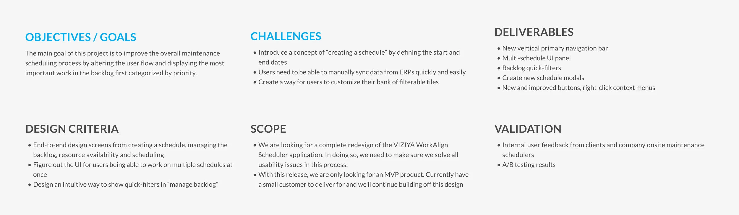
With my new discoveries, I quickly reframed the design objective and worked with product managers to define key features and scope of the project.
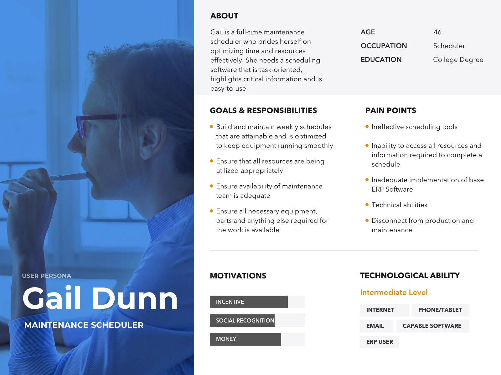
Once I redefined the scope of the project, I needed to start thinking about the core user who’d be using this product. In order to deeply understand our user’s needs, wants, motivations and pain points, I created persona profiles & empathy maps. I constantly referred back to these resources throughout feature development meetings to highlight problems and pain-points our users might be facing.
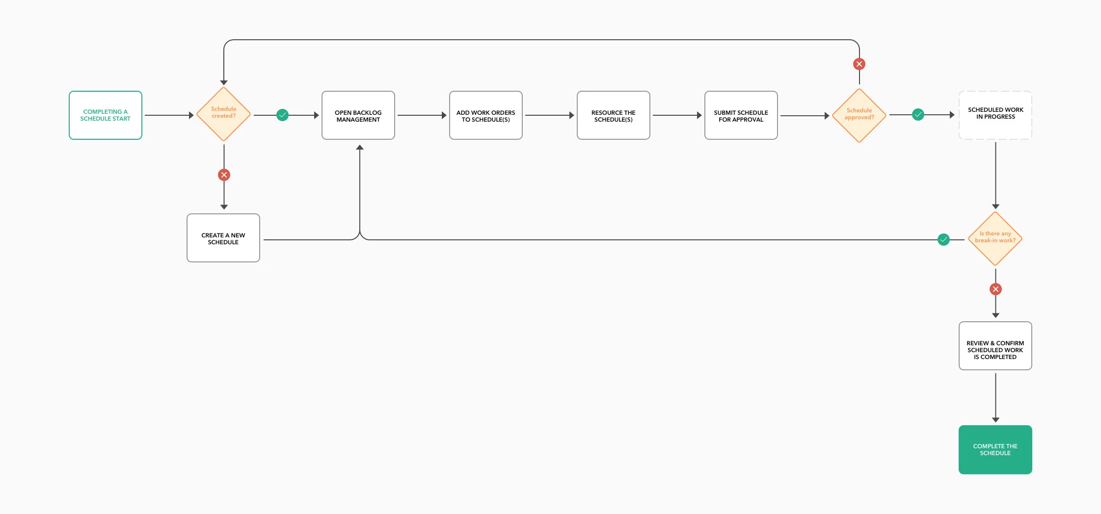
After going through several discussions and research, I started working on an improved version of the navigation architecture and user flows. This allowed me to understand how users would work their way through the product and ensure a smooth and intuitive navigation along with new features. I started with some white boarding in my company’s boardroom, and then refined them into digital versions.
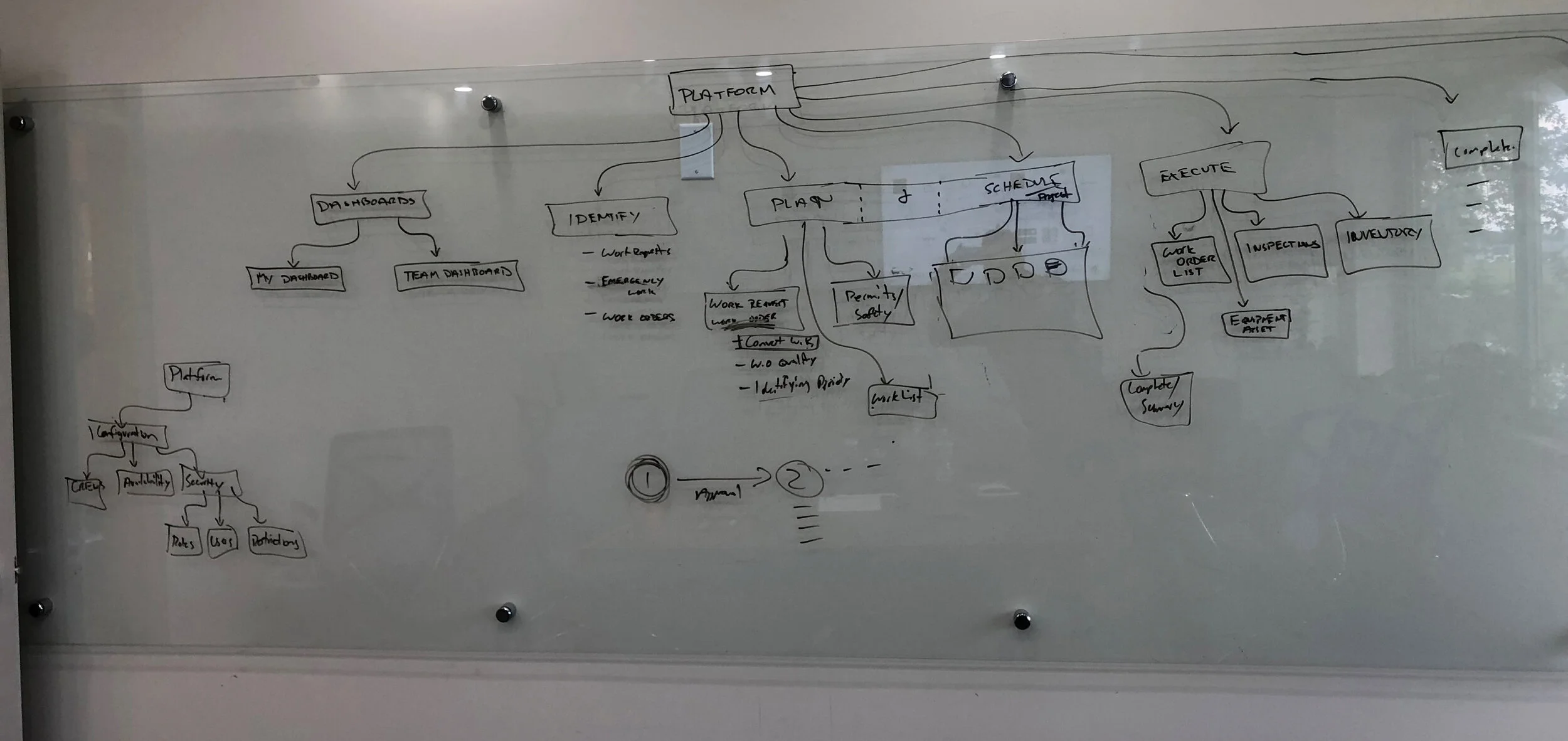
While the site-map above helped my visualize the navigation architecture, user flows allowed me to dive deeper into specific user tasks and helped identify key requirements and any friction areas.
Ideation & Exploration
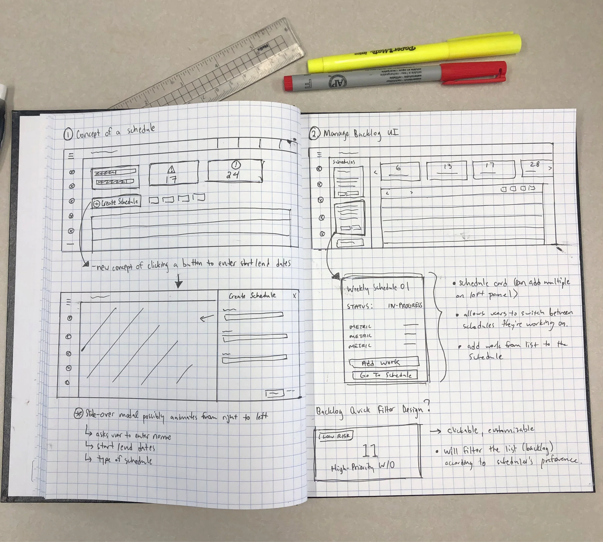
Once I got a better understanding of what key features needs to be included and the problems that need to be solved, I took some time to sketch layouts and try different design approaches. I like to draw low fidelity layouts as they help me determine very quickly what works and what doesn't. I can iterate easily. Sketches are also a good way to gather feedback before jumping ahead to detailed wireframes.
Usability Test Feedback
A/B Testing
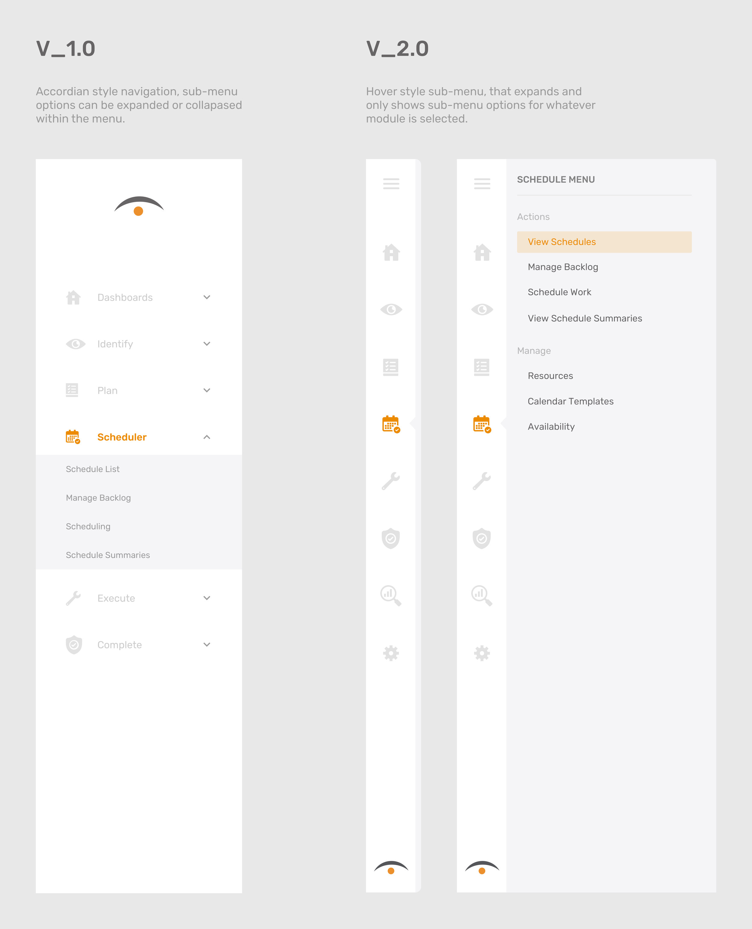
Based on user’s feedback, 60% of participants (6/10) prefer the dynamic navigation style (V_2.0). When analyzing the results the common theme was that people are used to interacting with modern navigation styles in their everyday lives. Some examples are SaaS applications like Slack, Jira or Microsoft Teams.
“Having the ability to hover and interact the menu without the click of the mouse makes it quick & easy to switch through different modules”
V_1.0 (Static)
Pros
Menu options are always visible to the user
Style is traditional and familiar to users
Clean & one-level
Cons
Takes up a lot of screen space
Not enough space to work with if there’s a lot of menu options
V_2.0 (Dynamic)
Pros
Conserves screen space
Hover-effect is modern and easy to understand
Allows for more menu options
Cons
Some users may not like the hover feature
Sub-menu options are hidden within the menu until hovered over
Let’s take a closer look at the details
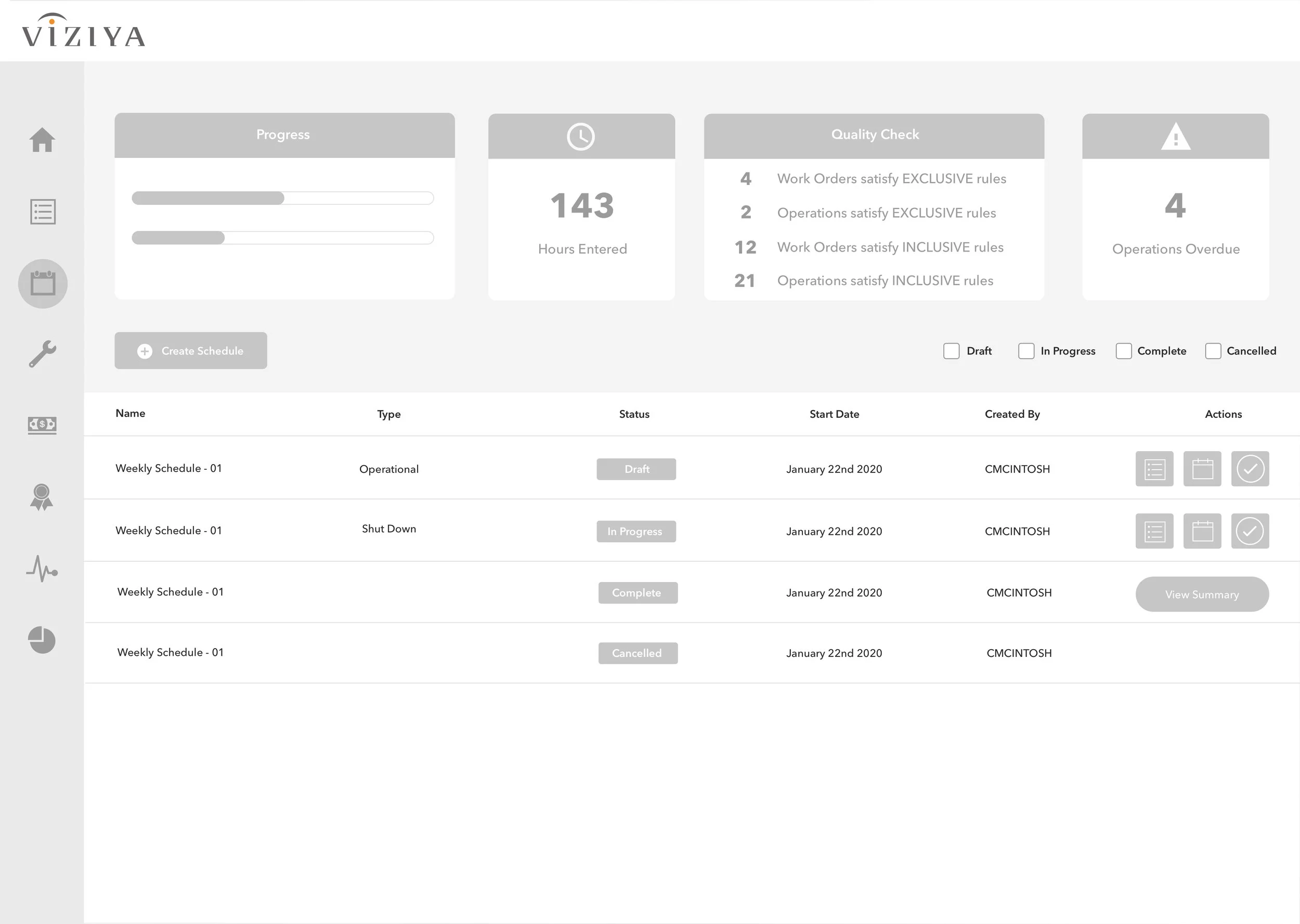
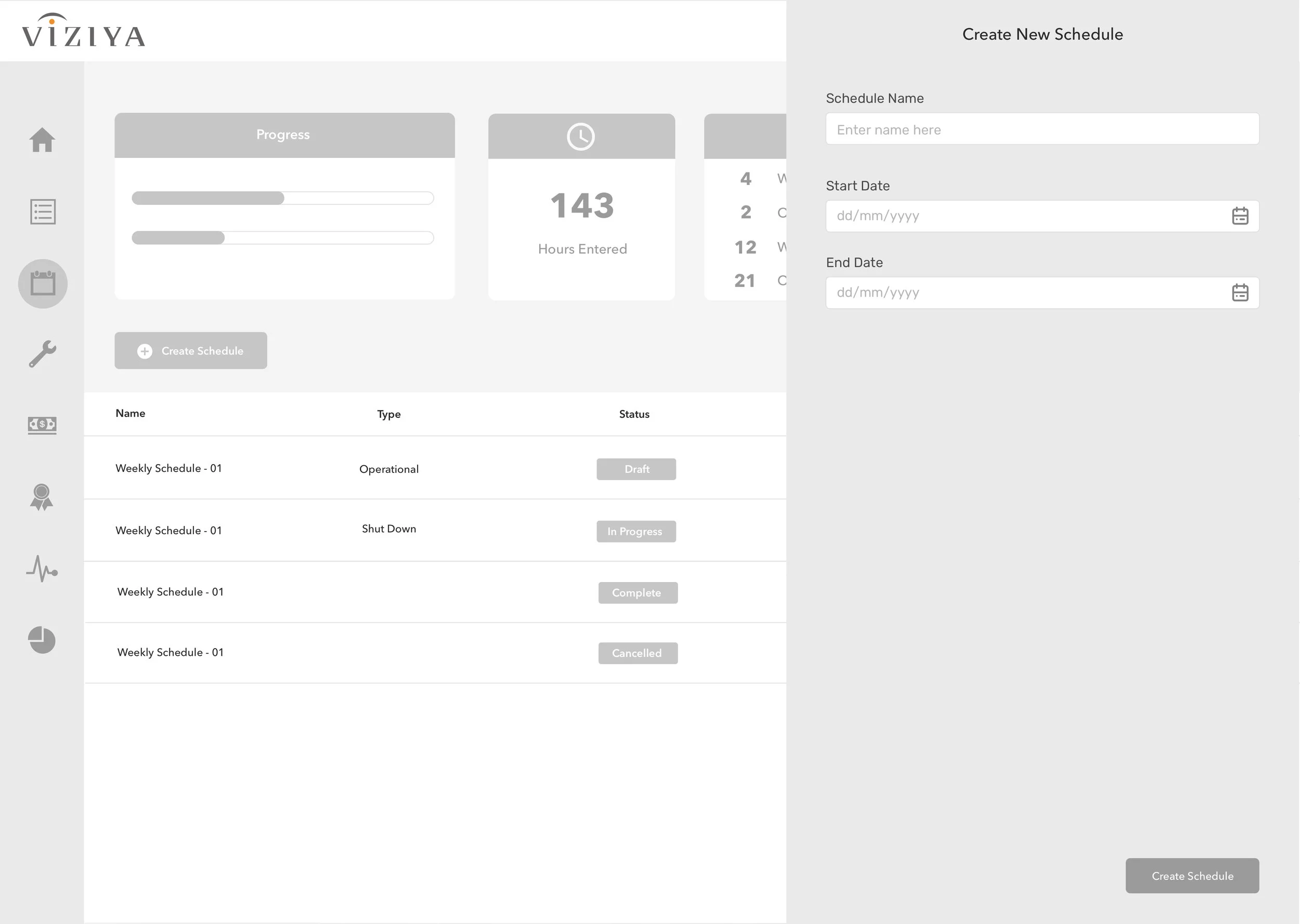
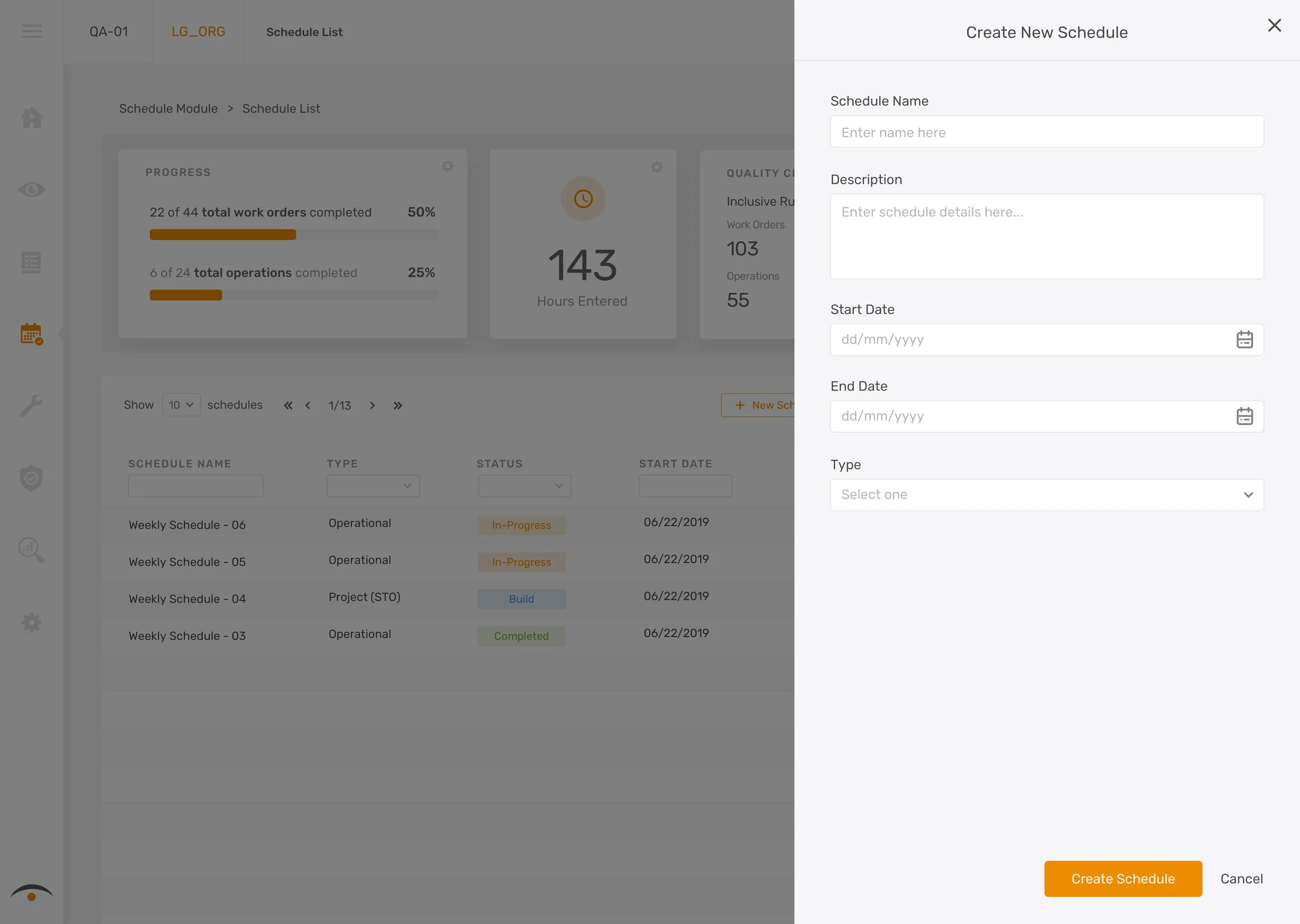
1. Users now have the ability to “create a schedule”
By altering the existing workflow, I’ve broken down the steps of the maintenance scheduling process. Users can now press the “new schedule” button to create a new schedule, assign it a name, start/end date, and type. Users are now able to organize their schedules and monitor their status. By adding this feature, users are now empowered to create different schedules for different purposes allowing them to prioritize work more effectively.
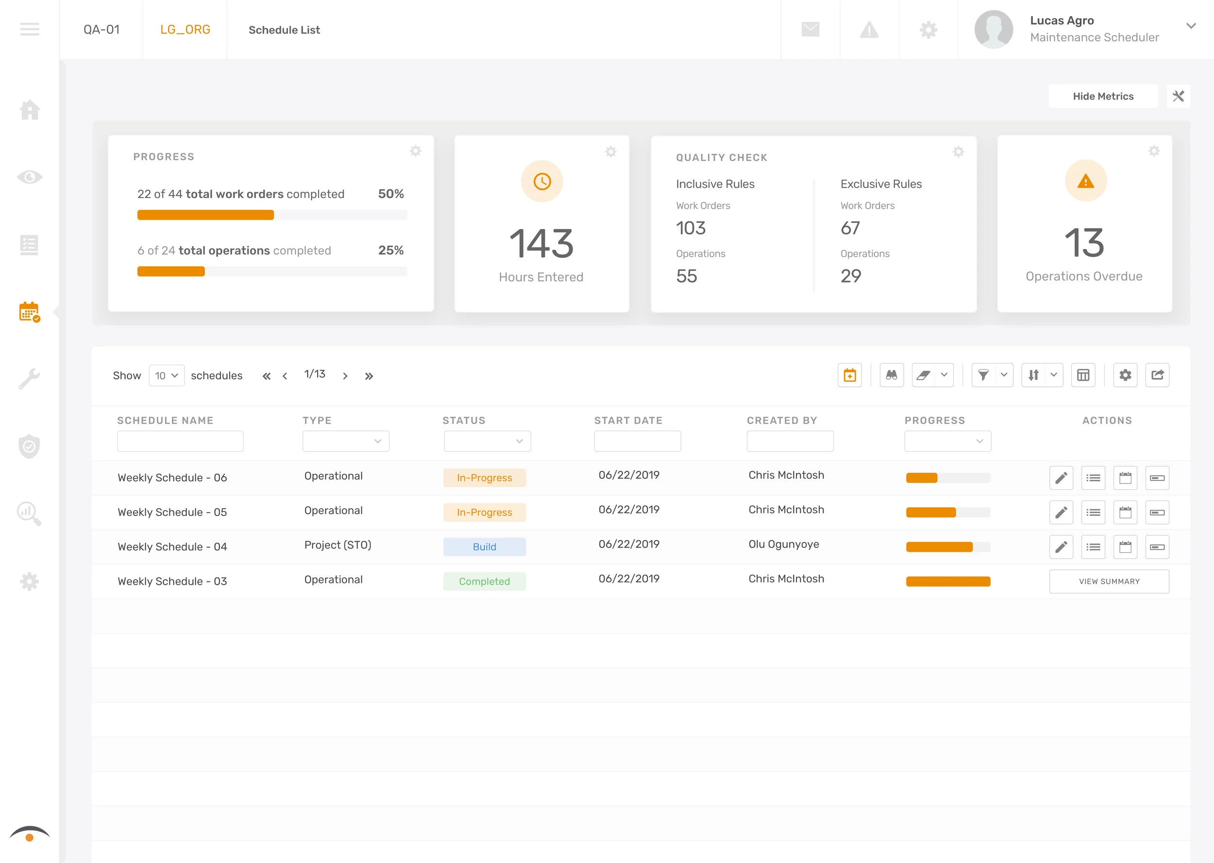
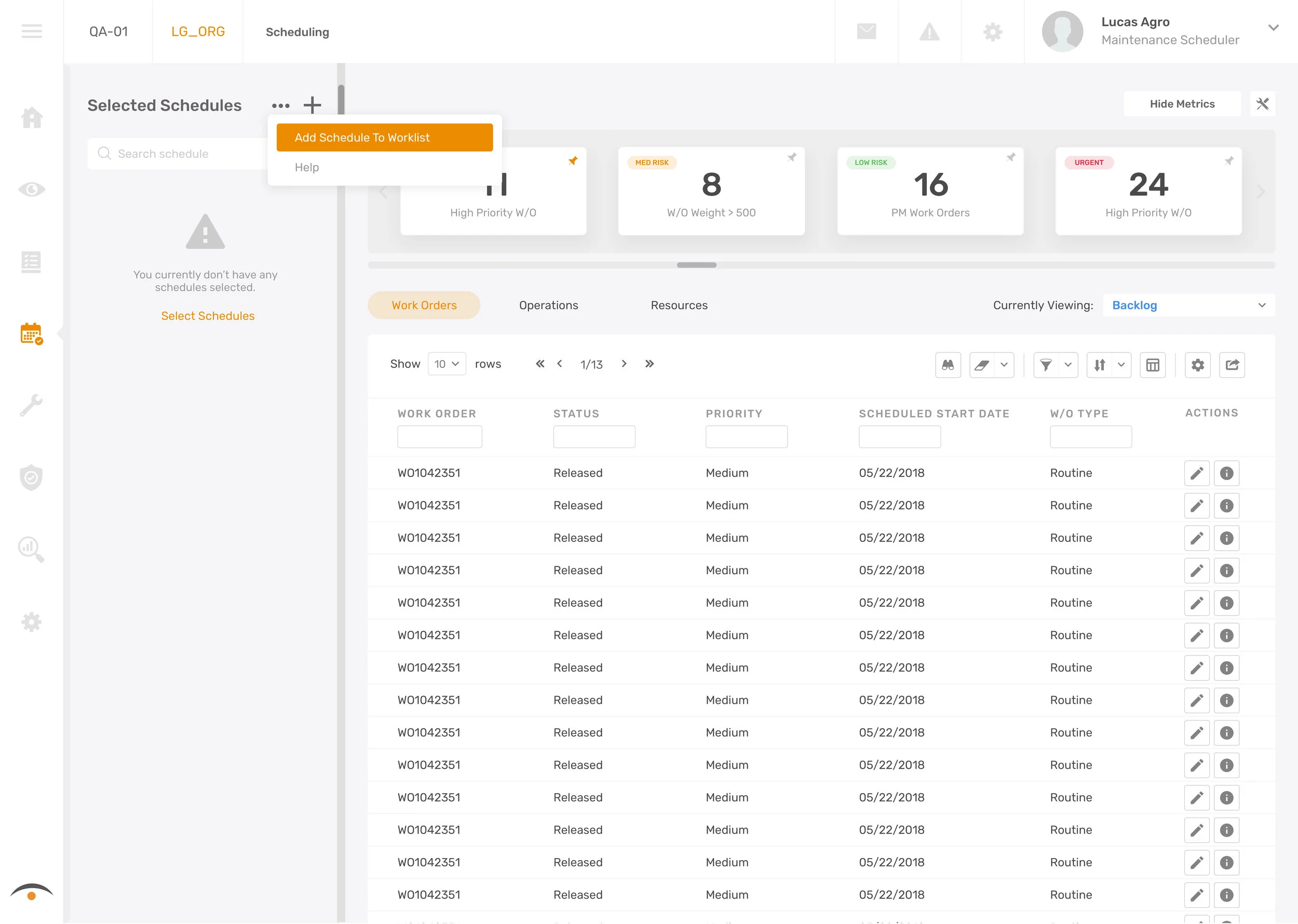
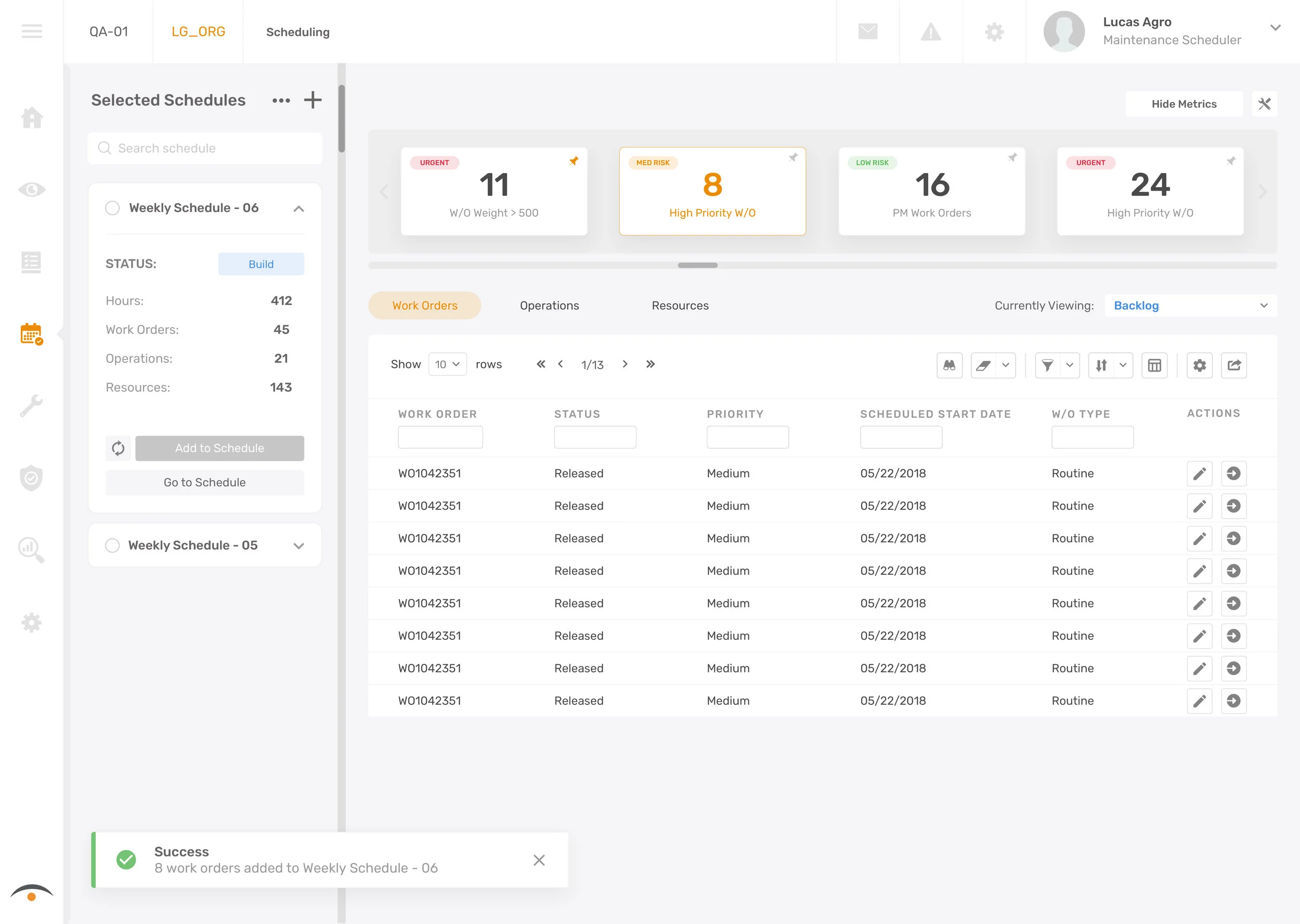
2. Working with multiple schedules & quick-filter tiles
Two new features are introduced in these screens. Users are now enabled to select multiple schedules they’ve previously created and add them to their work list panel on the left. This gives users the ability to add work to multiple schedules at once from the backlog. The backlog quick-filters allow maintenance schedulers to focus on important work first. Users can customize their bank of priority filters so that by a click of a button, they can organize their work quickly and efficiently.
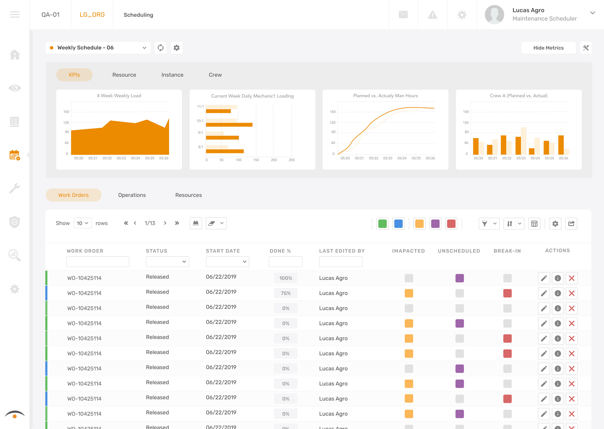
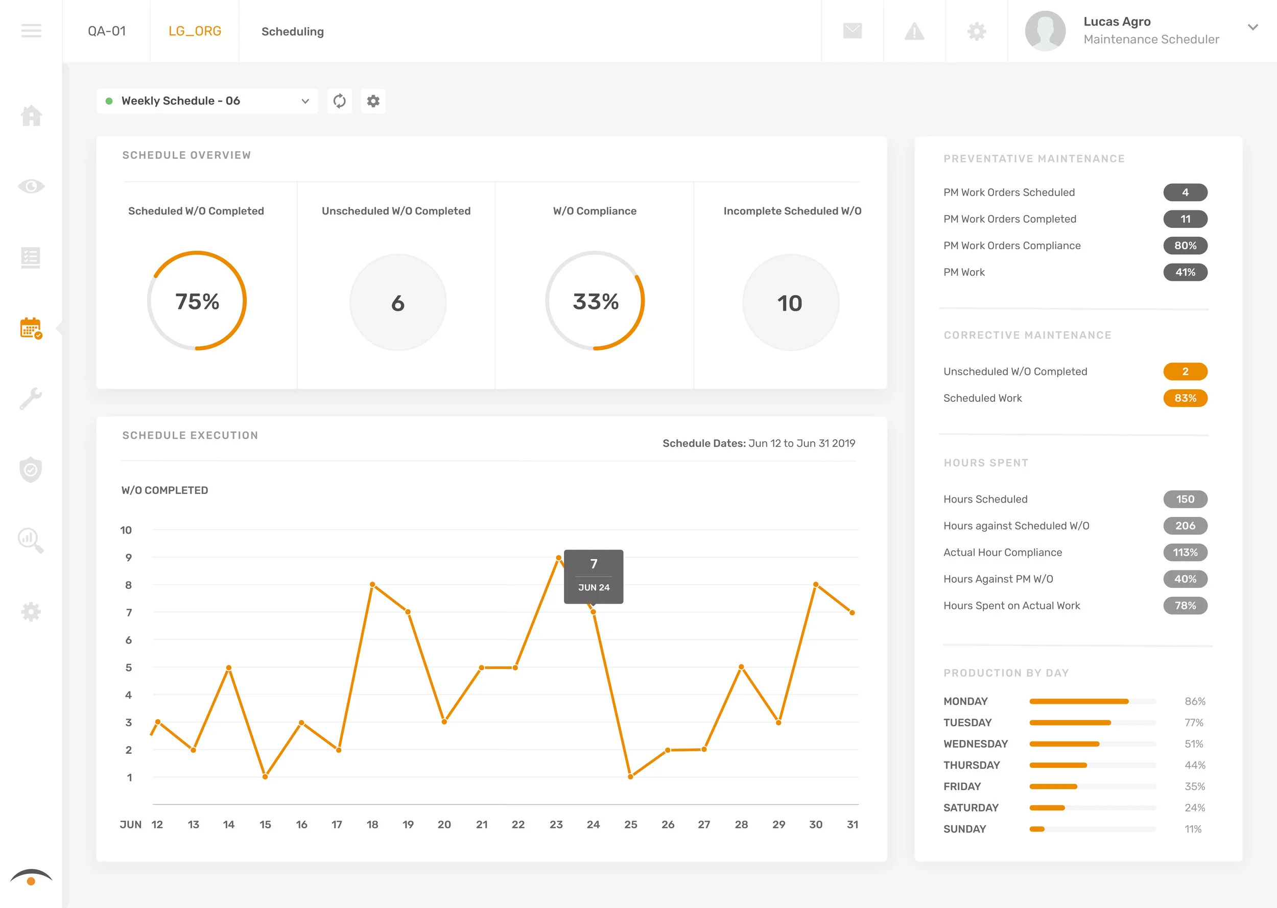
3. Improved scheduling workflow KPIs and summary features
Schedule KPIs are important in the beginning stages of maintenance scheduling because it gives the person scheduling a sense of understanding of the situation. In the new design, we introduce customizable KPIs with an easy-to-use configuration tool that allows users to build to most optimal schedules.
In addition, after a schedules completion the user will be given a summary of the schedule to review. The purpose of this screen is to help our users understand what was completed, what wasn’t completed and how to make future schedules more efficient.
Summary
The goal of this project is to give schedulers more control over the work they want to schedule while improving existing scheduling experience.
Continuously testing out my design and receiving feedbacks from the end users throughout the design process has really helped me to making sure the designs are addressing the right problems while also making sure the experience is intuitive and easy to use for the users.
What I’ve learned from this project:
Enterprise software is usually highly specialized and complex (It’s not always the best idea to design for total simplicity like when designing for consumer-based apps)
The user and the customer are rarely the same person (The people purchasing your design might not immediately see the value in your designs because they aren’t the actual ones using it on a daily basis)
There is less competition for enterprise vendors and a higher barrier to entry (Because of less competition, less effort should be put into the “flashiness” of the product and more effort should be put into delivering functionality and flow)
Next Steps
I’ve worked closely with our product manager to breaking down the final design into small incremental releases. We focused on prioritizing features that are easiest to implement while yielding big results. As a brand new product, our goal is to design a MVP. It’s critical that we validate our design hypothesis so that we can deliver the best product possible.